

They say you shouldn’t judge a book by its cover, and while I agree with that sentiment, I do judge books by their covers. As the primary designer for all of Shotgun Honey’s releases, I’ve developed an admiration for cover design, and the various methods a designer will take to produce a truly inspirational cover. In this pursuit, I follow websites like The Casual Optimist, Spine Magazine and Paste. I’m always on the look out.
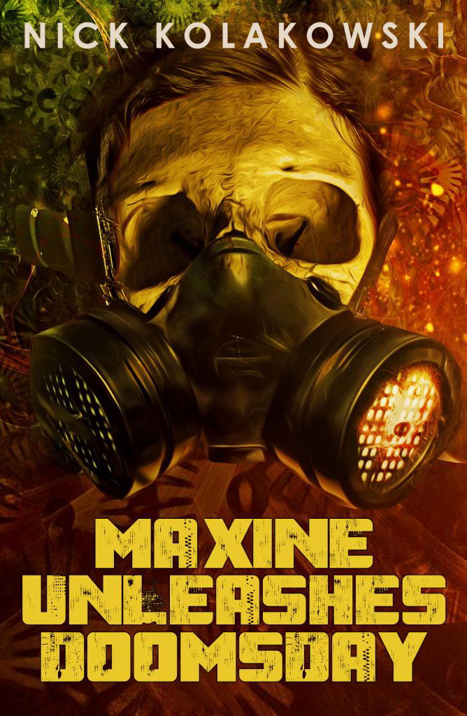
MAXINE UNLEASES DOOMSDAY
(Down and Out Books)
Design by Zack McCain
One thing you want a book cover to do is pop, stand out, and create an immediate response. The visceral response I got when I saw this cover made me a bit jealous, because I really wish had the artistic chops to pull off a cover like this.
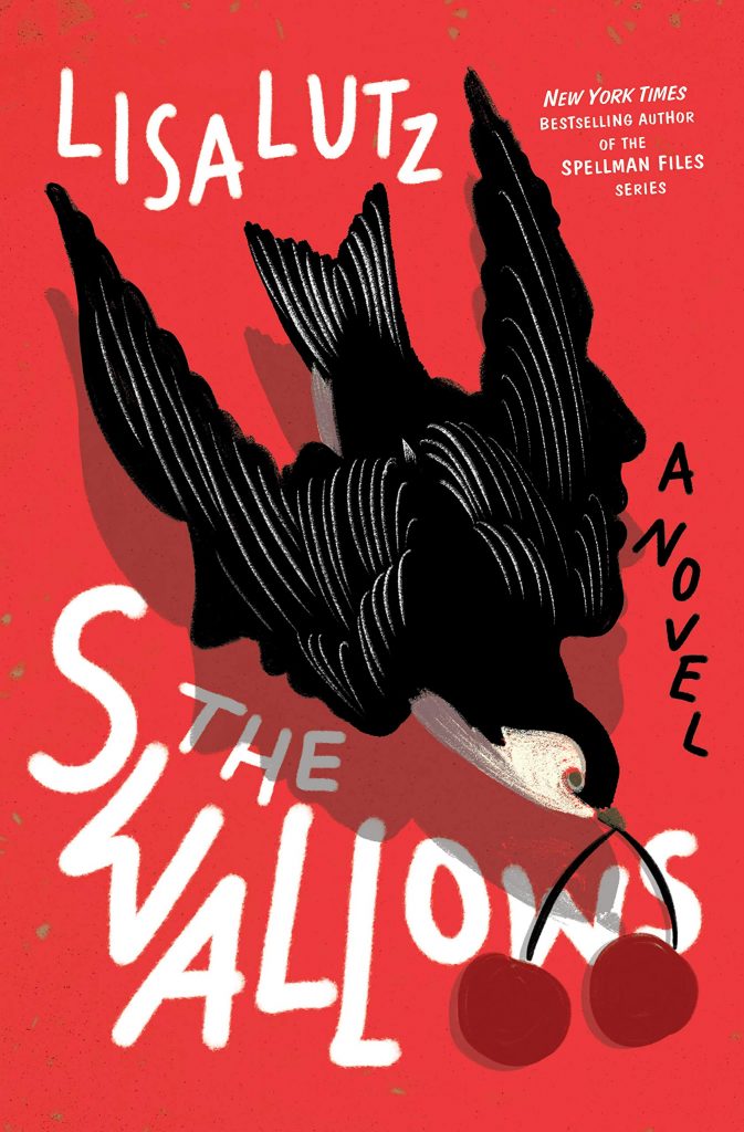
THE SWALLOW
(Random House)
Design by Emily Osbourne
A good graphic can make or break a cover, combine that with a primary color, the cover will jump out to the consumer. It’s simple, but strong. I like also the use of hand-written typography that pairs well with the artwork of the swallow.
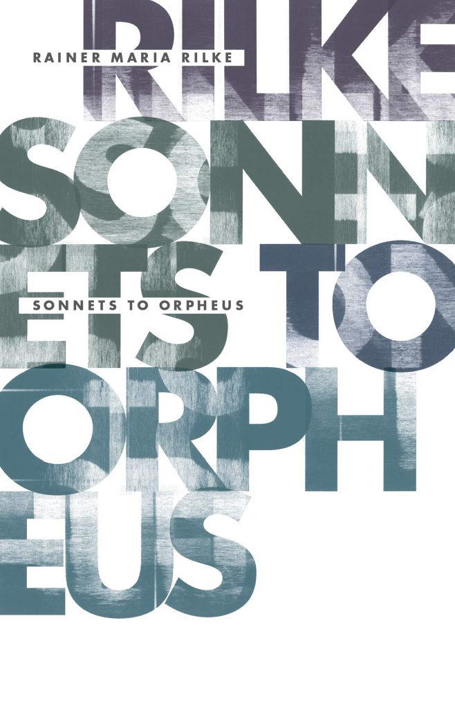
SONNETS TO ORPHEUS
(Open Letter Books)
Design by Anne Jordan & Mitch Goldstein
Simple is a term that can be taken negatively, but it is also an aesthetic that allows artist to not overburden or overwork the design, and most of all over think. In this re-print of Rilke’s Sonnets to Orpheus, the design is derived from the title, creating interest by breaking up and overlapping text to create texture and interest. I’m a bit envious because with the way our books are published, text can’t be full bleed, but the inclusion of the title and author in smaller block might be the solution to my conundrum.
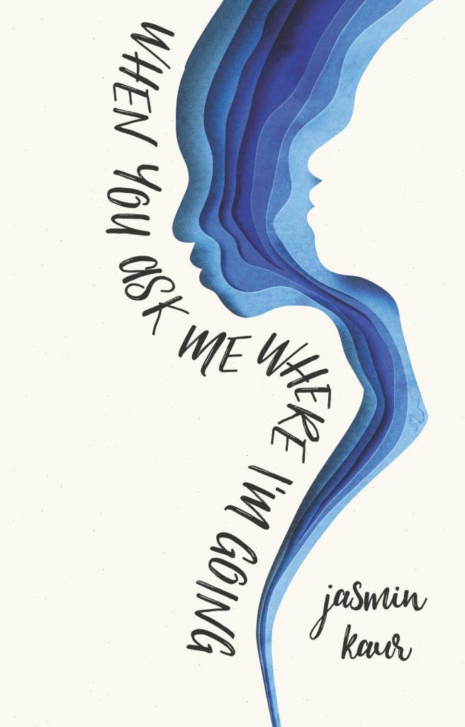
WHEN YOU ASK ME WHERE I’M GOING
(Harper)
Design by Jenna Stempel-Lobell, Art by Eiko Ojala
I’m a digital designer, and so what I work with often requires manipulating stock materials. A cover like this could be replicated digitally, but it’s not. It follows a trend of covers being created from paper art. There’s an intrinsic value to that, because I could see the art being hung and displayed. An ability to view actively how light plays with the physical object. The flowing typography works, but it is the art that makes it shine.
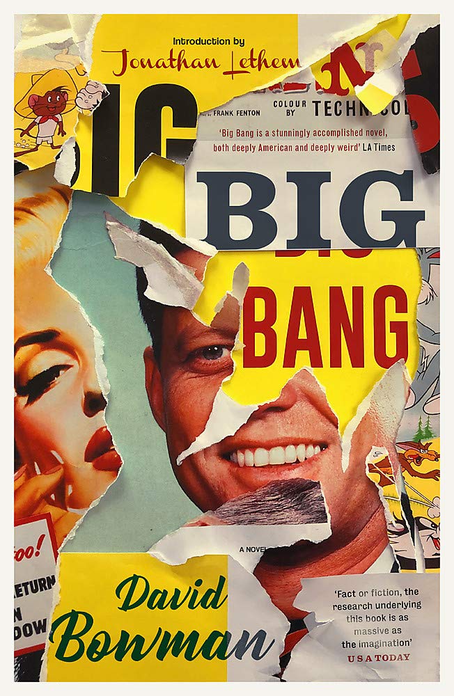
BIG BANG
(Corsair)
Design by Jamie Keenan
I don’t know if it is the difference in aesthetics between the US and the UK, but I often am drawn to the UK version of covers. David Bowman’s paperback release of Big Bang is a nice paper collage, which could be digitally rendered, but is effectively put together in a deconstructive manner.
There are more I could choose, and in the coming year I may do something better to curate those outstanding covers of 2020.
